In our series of color trends for Winter 2021 we have already seen the colors Blue and Green as the highlights chosen by Pantone as the main colors for next winter. And today we will see the third color most seen on the catwalks in New York and London. Come with us!
Hi guys all right?
Today we are going to talk about the last of the colors that was highlighted on the catwalks, red! A color that has always been a classic, will be one of the darling colors of the next season.
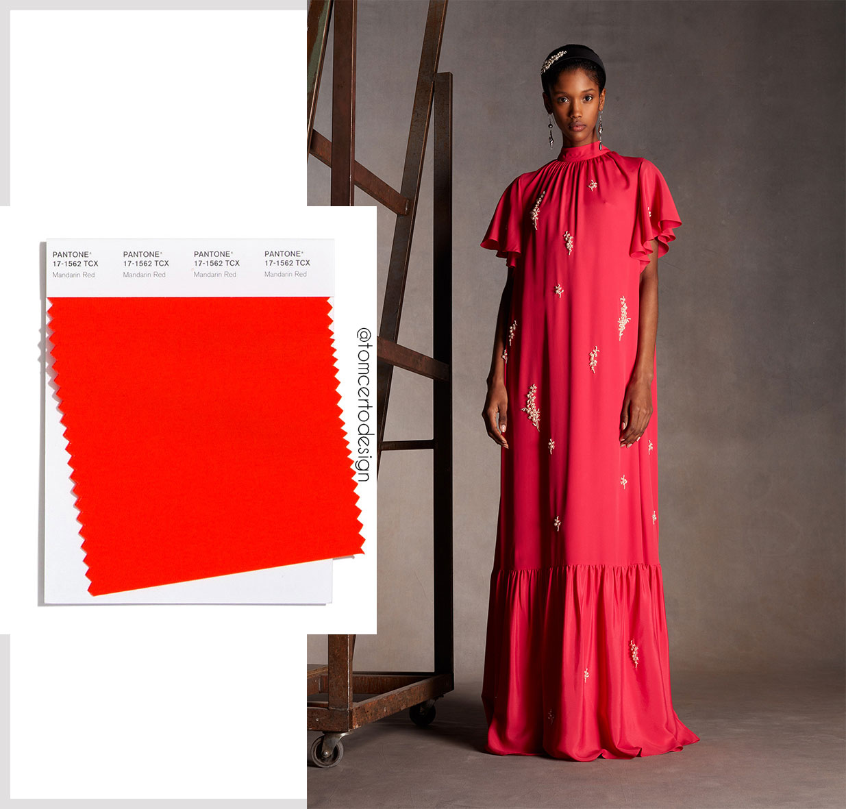
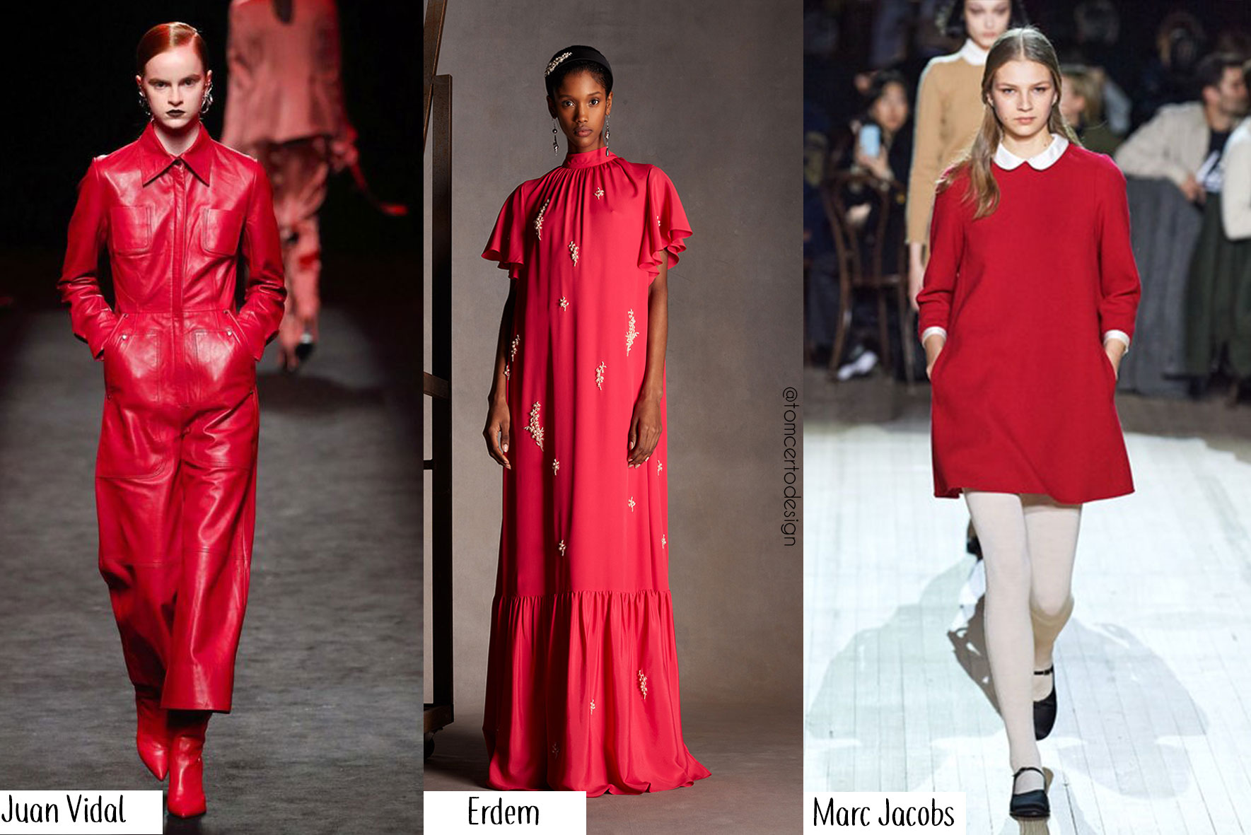
And to end our winter color series 2021, we will have red for every taste, from the brightest hue to the most discreet tone, after all red is one of the undisputed colors that always stands out in looks regardless of the hue or season, whether in the complete look or just in some detail. Among the warm winter tones that we saw on the catwalks like yellow, orange, nudes this winter, Red Samba (pictured below) was highlighted on the catwalks in New York and Mandarin Red (pictured below) as highlighted on London runways, we will have an intense winter and with many colors of that we are sure!


Red is so classic that to make combinations with it either in prints or in plain looks it is an easy color to work with. It is possible to combine red with neutral colors like cream, white, nude and black, as well as strong colors like Blue that we saw here on the blog that will be with everything next winter, for those who haven't seen it yet (click here) or even the green that we also talked about HERE, and for those who want to dare, you can still overlap with other shades of the warm color chart like orange. Options abound, just choose your favorite!

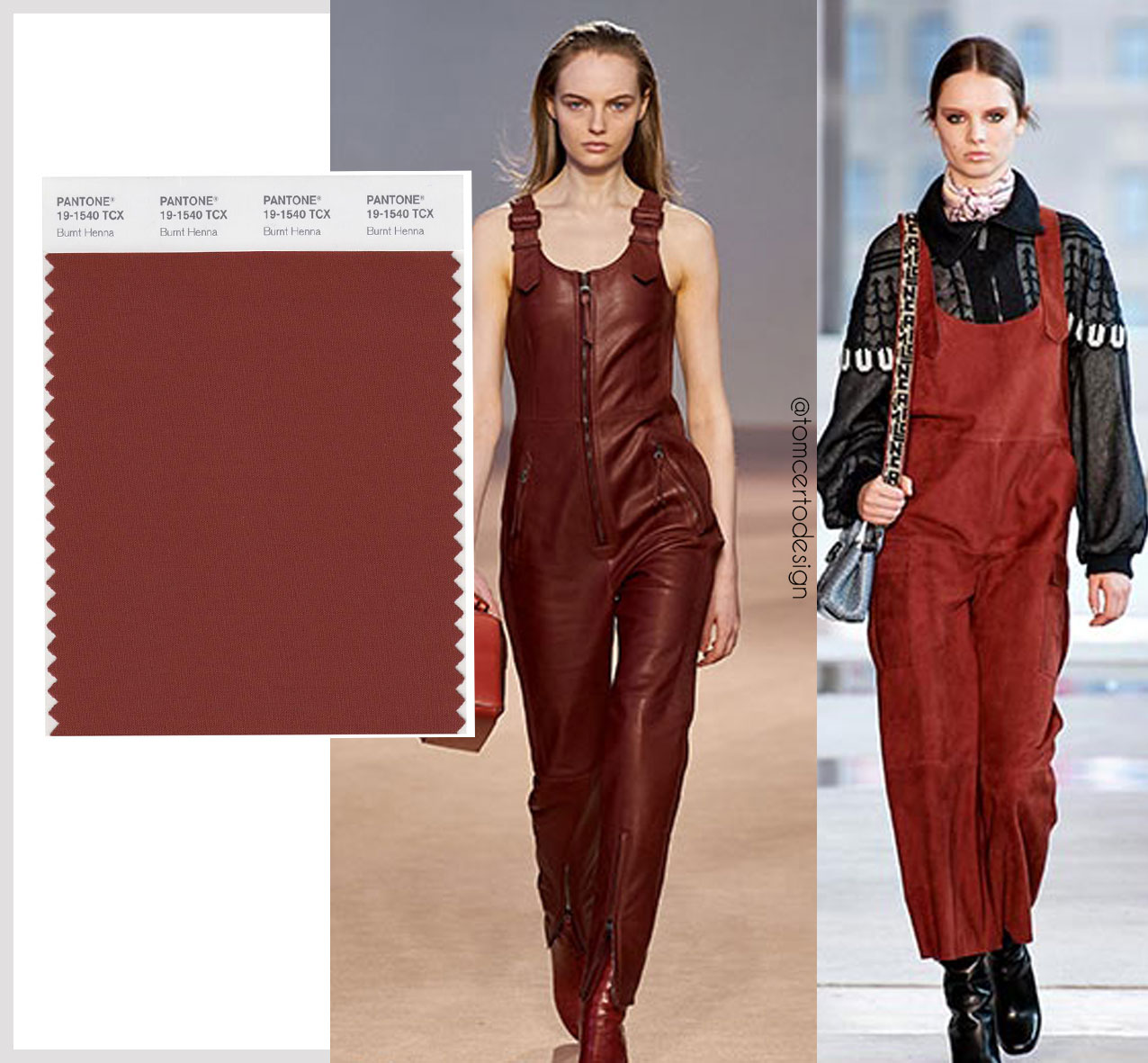
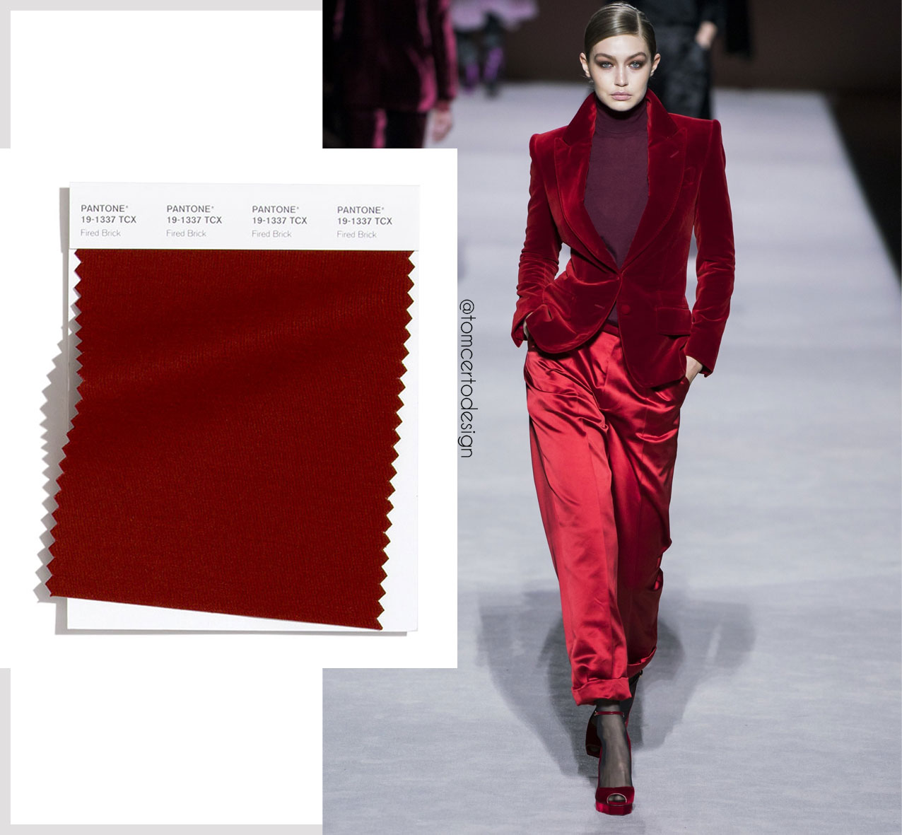
Still in shades of red, we have the earthy tones of this intense color like Burnet henna, a more intense and discreet color, but it brings a lot of glam to the look, what stood out on the catwalk was Pantone Burnet Henna and Fired birck, you can choose the right tone for you to abuse and use! These colors were featured on the catwalks of stylists Salvatore Ferragamo, Stella McCartney. A beautiful shade of red without overdoing it. Tell me do you like that tone or prefer red samba?


Next week we will start talking about prints and patterns on the catwalks for winter 2021, where we will see the accent colors along with the main prints and patterns for the next season, pick up paper and pen to write down everything to put into practice for your collection.
And tell me here what do you think of these shades of red for winter? Tell me here what your favorite shade is among these 3 options of red.
Our winter collection 2021/2022 is almost out of the oven with prints and incredible colors that we will soon be launching on the site. Wait!
And for you who like to follow everything about fashion and to know more news for your next collections keep an eye here, we have a new post every week here about the latest trends directly from Europe, and if you want to know our entire creation process here at the studio daily follow us on instagram and learn more about our creative process.
-------------------------------------------
Want to know how to have a print of ours in your collection? Send us an email we'd love to talk to you.
Take care, see you soon!
Tom Certo Design,
Instagram: https://www.instagram.com/tomcertodesign/?hl=pt-br
This email address is being protected from spambots. You need JavaScript enabled to view it.


