
")
")


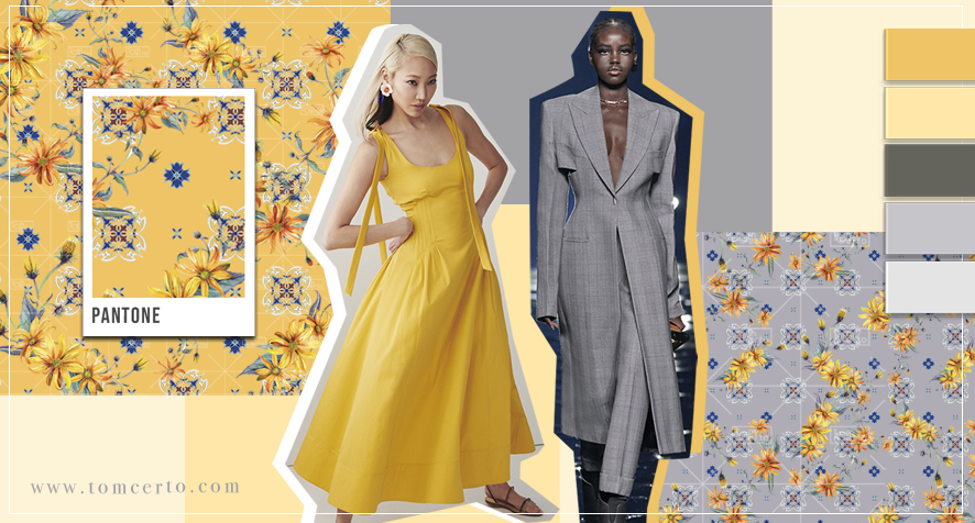
The florals are always highlights and this year we have a specific floral that stood out on the catwalks! Want to know more? Stay here and we'll tell you everything!
Hi guys, how are you?
You who are with us already know, we are talking about winter trends 22 here on the blog. We did seasonally research and study trends for the launch of our prints collections here at the studio, (check here) and for this reason we share with you a little bit of everything we found on the catwalks, and also in the windows here in Europe.
In the trends of winter 22, we could not fail to talk about the colours chosen by the world-renowned company, Pantone, all the niches of fashion, decoration, designer and the like are anxiously awaiting the colour that the company annually chooses the “colour of the year”.
For this colour to be elected the colour of the year, the company conducts a market, behavioural study and also a chromatic study of colours, all to define the colour of the year!
One of the most anticipated colours was undoubtedly this year 2021, since 2020 was a completely atypical year due to the Covid-19 pandemic.
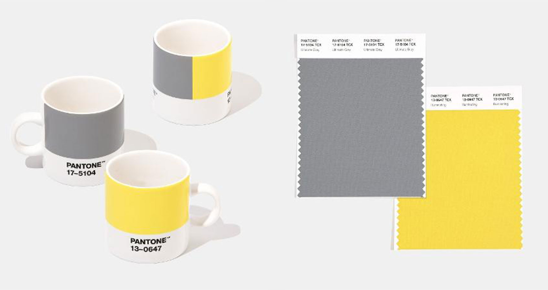
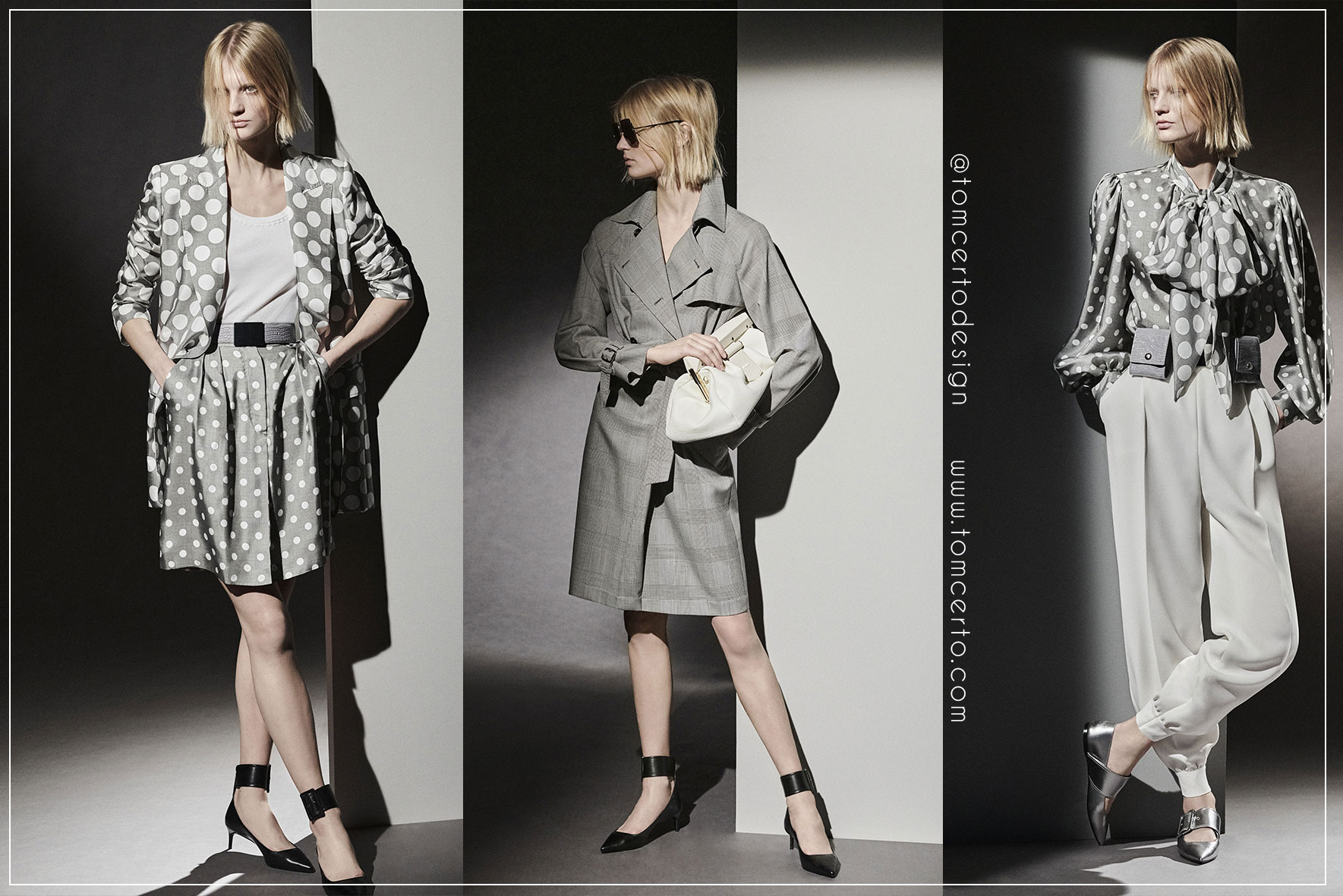
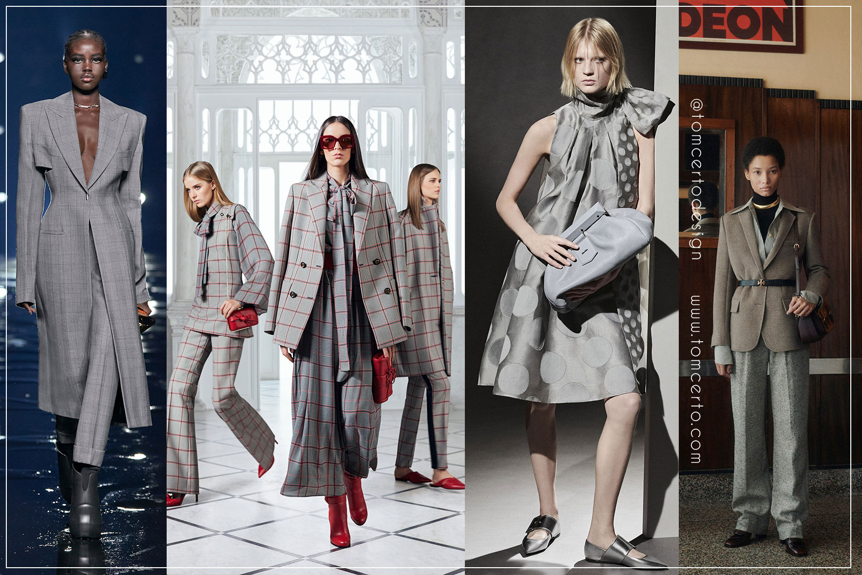
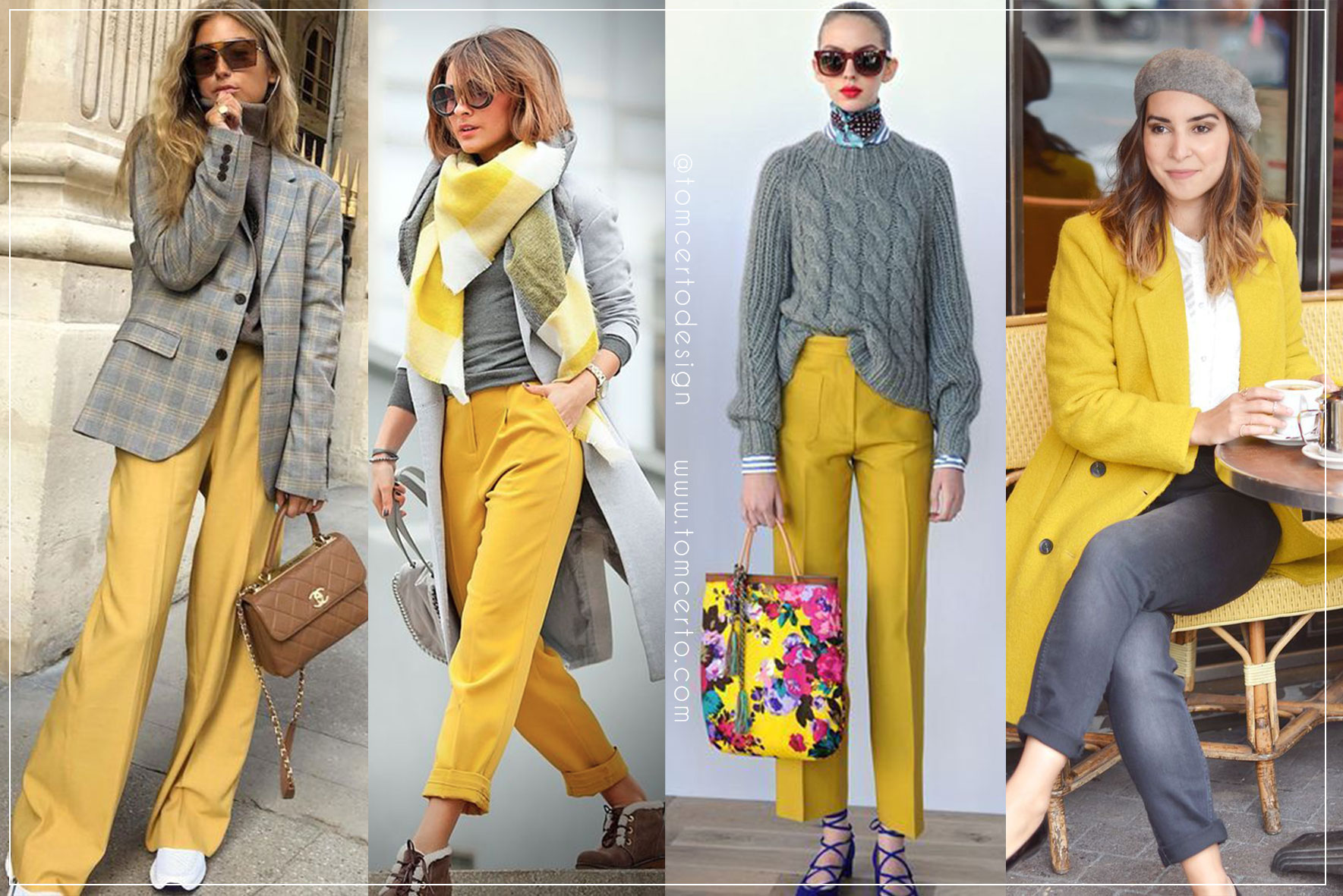
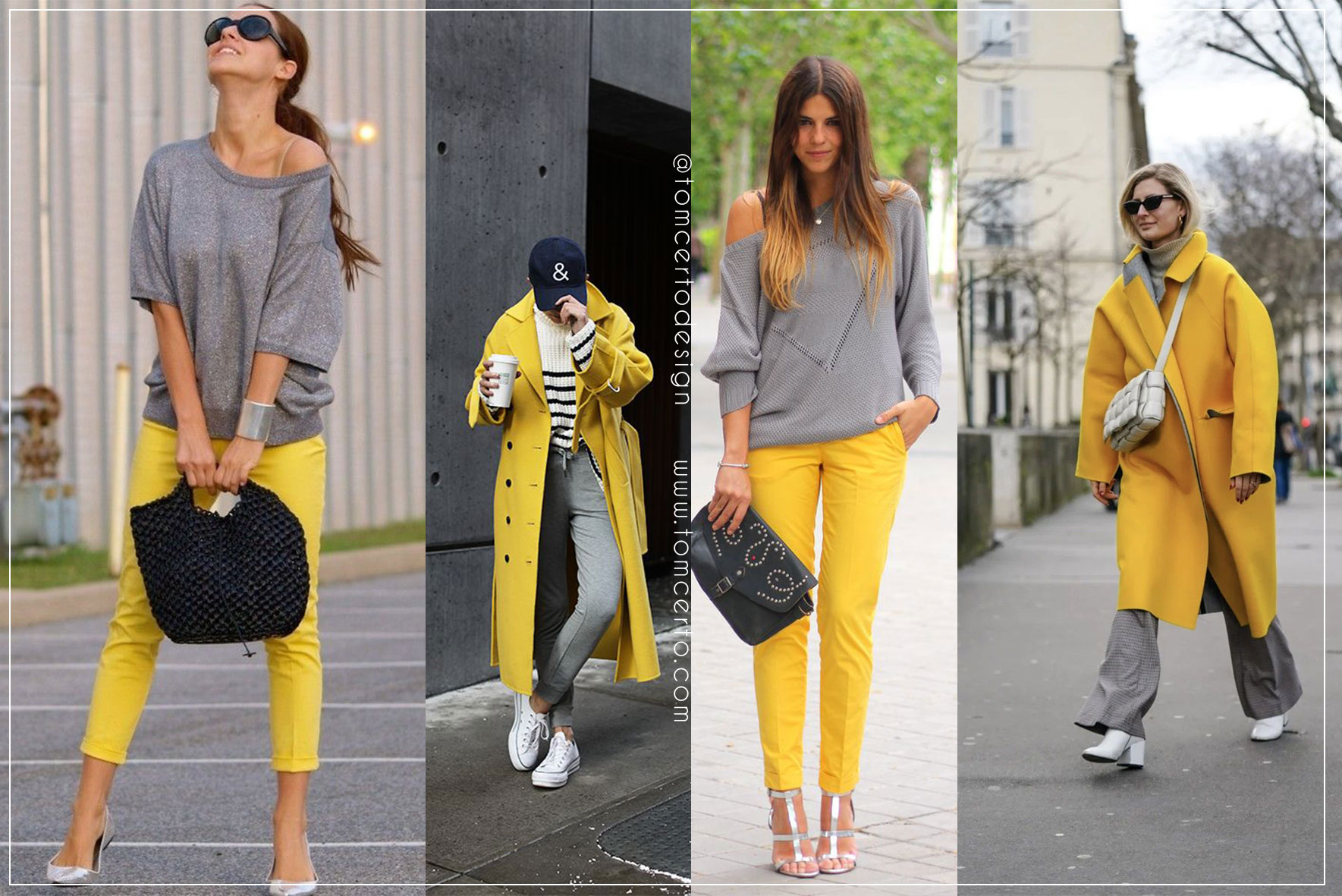
And this year 2021 two colours were chosen: PANTONE 17-5104 Ultimate Gray and PANTONE 13-0647 Illuminating yellow, and according to Pantone, their combination expresses a message of strength, resilience and hope.
According to Nick Bazarian, senior product manager for digital business at Pantone, More than just a trend, Pantone's colour of the year is also a reflection on the changes and needs of the moment:
“The colour of the year is very much a statement of how the world is feeling.”, Adds Nick.
So, let's check how this colour appeared on the catwalks reinforcing this trend for the next winter season 22?
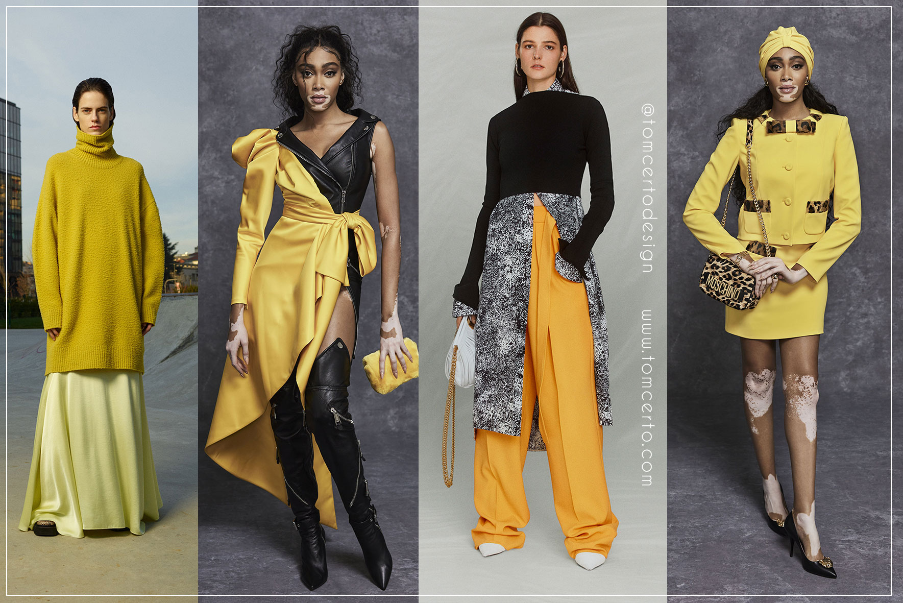
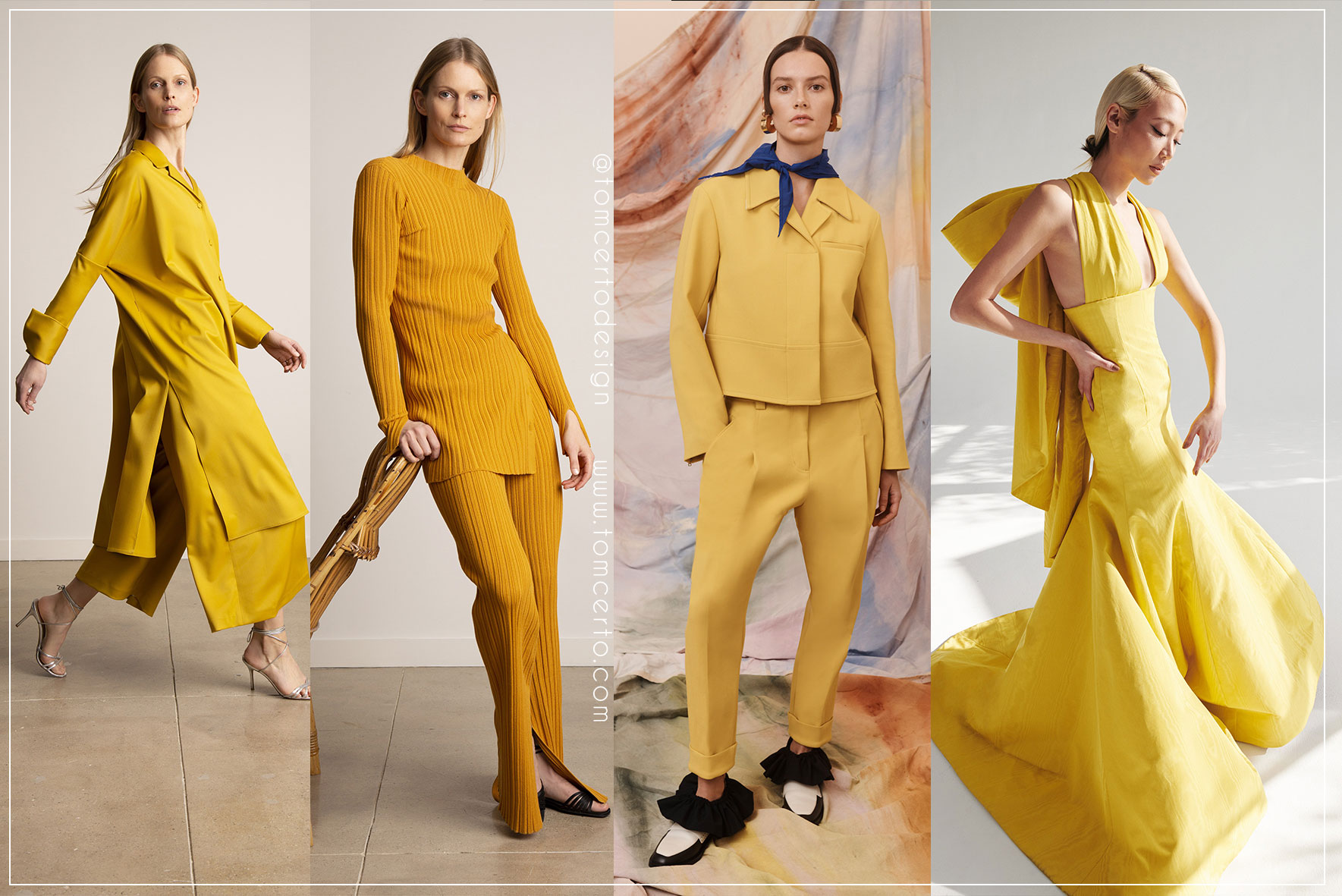
For many, gray is easily used commercially in clothes, but for those who still have doubts on how to use this combination of gray and yellow in a commercial way, here are some tips on looks and combinations for you to be inspired and not be afraid to make this one. colour combination.
And then what did you think of this new colouring for the year 2021? Are you going to bet either, or both on your next collection?
If you want to check out everything we've already shared with you about winter trends 22 CLICK HERE.
Take care, see you soon!
Tom Certo Design,
Email: This email address is being protected from spambots. You need JavaScript enabled to view it.
Discover our exclusive seasonal collections by contacting us, click here.
Buy our prints in the patternbank community, clicking here.
Buy our prints directly on the fabric, clicking here.
Come be part of our family and have our exclusive prints in your collection!